21 Apr 2011
Correlation and Covariance
This post will illustrate how to:
- Create a correlation matrix of variables using the
correlate command.
- Display a correlation matrix as a covariance matrix.
- Obtain the statistical significance of a correlation using the
pwcorr command.
Correlation Matrix
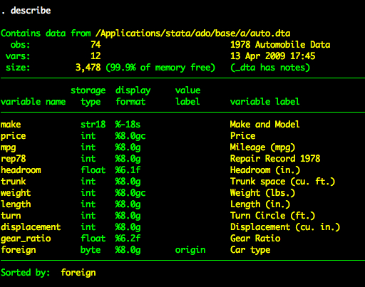
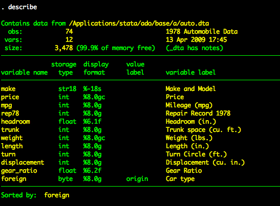
We’ll use the auto dataset for this tutorial.

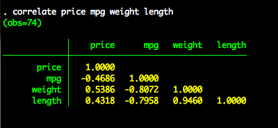
We’ll create a correlation matrix of four variables – price, mpg, weight, and length.
correlation price mpg weight length

Note: We can shorten the correlation command to corr for convenience.
Covariance Matrix
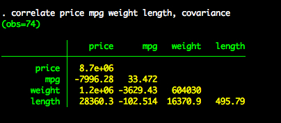
If we want to create of covariance matrix, we simply add the covariance option to the correlation command.
correlation price mpg weigh length, covariance

Statistical Significance of a Correlation
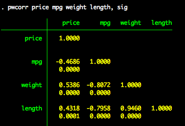
The correlation command produces a clean correlation matrix (or covariance matrix with the covariance option). If we want to see the statistical significance of a correlation, we need to use the pwcorr command with the sig option.
pwcorr price mpg weight length, sig

21 Apr 2011
Multiple Regression
This post will:
- Show how to extend bivariate regression to include multiple predictor variables.
- Show how to manually create partial and semipartial correlations using residuals from a regression model.
- Show how to use the
pcorr command to obtain partial and semipartial correlations.
Multiple Predictors
We will again use the auto dataset.

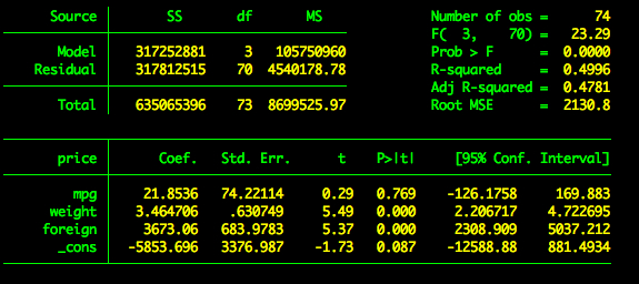
Suppose we want to regress price on three variables – mpg, weight, and foreign. To add three predictors, we simply add the variables we want after the dependent variable.
regress price mpg weight foreign
This produces the following output.

Partial and Semipartial Correlations - Manual Method
Recall that a partial correlation is the relationship between x and y once the shared variance between x and x2 has been removed from x and once the shared variance between y and x2 has been removed from y. A semipartial correlation is similar except that we only remove the shared variance between x and x2 (i.e., y remains untouched). Note: Although I’ve only referenced x2, we can in principle include many control variables as our example will show.
Suppose we want to obtain the partial correlation between price and mpg controlling for weight and foreign. To do this we need the part of price that is independent of weight and foreign. We also need the part of mpg that is independent of weight and foreign. We can get this information with residuals.
The part of price independent of weight and foreign
To obtain the part of price independent of weight and foreign we regress price on weight and foreign.
regress price weight foreign
We then save the residuals for price. We’ll call this priceres
predict priceres, residuals
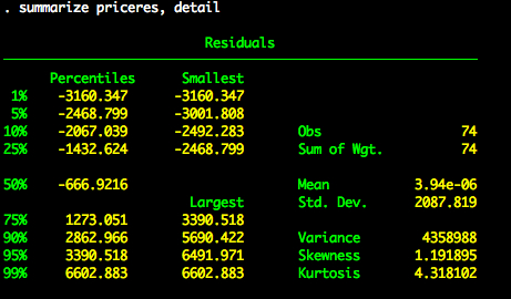
We now have a new variable in our dataset called priceres.
summarize priceres, detail

The part of mpg that is independent of weight and foreign
At this point, we need to repeat what we did about except substitute mpg for price. We regress mpg on weight and foreign.
regress mpg weight foreign
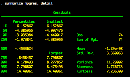
We save the residuals for mpg. We’ll call this mpgres (not very original, I know).
predict mpgres, residuals
We now have a new variable in our dataset called mpgres.

Partial correlation
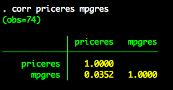
We know have everything we need for the partial correlation between price and mpg controlling for weight and foreign. Specifically, we have priceres – which is the part of price that is independent of weight and foreign. We also have mpgres – which is the part of mpg that is independent of weight and foreign. Therefore, to obtain the partial correlation we simply need to correlate priceres and mpgres.

Semipartial correlation
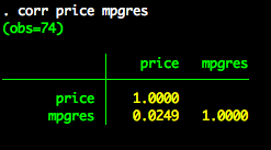
We also already have everything we need for the semipartial correlation. Recall that for the semipartial correlation we only remove the shared relationship between x and the x2 (or set of covariates). We don’t do anything with y. In our example price is our y variable. So to compute the semipartial correlation we correlate price (i.e., the “untouched” y variable) and mpgres (i.e., the part of mpg that is independent of weight and foreign).

Partial and Semipartial Correlations - pcorr
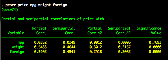
Thankfully Stata has a built in command for computing partial and semipartial correlations – pcorr. To obtain the partial and semipartial correlations, we type:
pcorr price mpg weight foreign
Note that the first variable listed is considered the y variable. All other variables are variables are considered x variables. Stata reports as many partial and semipartial correlations as there are x variables. Additionally, Stata reports the squared partial and squared semipartial correlations. These are interpreted as the proportion of shared variance between y and x controlling for the other x variables. The partial and semipartial correlations listed for mpg are the same as what we found above.

19 Apr 2011
Bivariate Regression
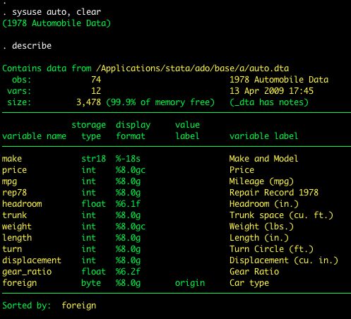
In this post we’ll use the system dataset auto.

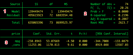
To estimate the model we use the regress command in the command window. The regress command follows the general format of regress dv iv, options. Type help regress or visit the online help for regress for a description of the options available for regress. For example the regression of price on mpg is estimated as follows:

The output includes:
- The ANOVA source table
- Descriptive statistics and effect sizes
- Coefficients, hypothesis tests, and confidence intervals
Standardized Coefficients
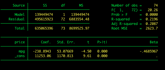
Suppose we would like Stata to report standardized coefficients. To get standardized coefficients we add the beta option to our command.

Visualizing Regression Lines
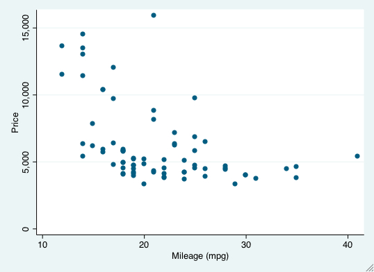
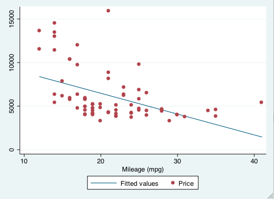
We can visualize the relationship between two variables with a scatterplot. Stata’s graphics provide several useful commands for including regression lines on a scatterplot. We’ll discuss the lfit and lfitci commands.
To produce a scatterplot between price (y-axis) and mpg (x-axis), we use the graph twoway scatter command.
graph twoway scatter price mpg

Now let’s add the regression line to the plot. The lfit graph command allows us to do this (lfit stands for linear fit). However, we don’t want the regression line in isolation. We want it on top of the scatterplot. Stata lets you combine twoway graphs in one of two ways: (1) using parentheses or (2) using pipes. To add the regression line with parentheses, we type:</p>
graph twoway (lfit price mpg) (scatter price mpg)
The first set of parentheses is the regression line and the second is the scatterplot. This produces the following plot:

To add the regression line with pipes (this produces an identical plot as above), we type:
graph twoway lfit price mpg || scatter price mpg
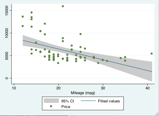
It can be nice to include confidence intervals on the plot. To do this we simply change the lfit command to lfitci, where the ci refers to confidence interval.
graph twoway lfitci price mpg || scatter price mpg

24 Nov 2010
Graphing Distributions
This post will demonstrate how:
- Use the `twoway function’ plotting command to visualize distributions
- Add colored shading to a graph to visualize portions of a distribution
The twoway function command
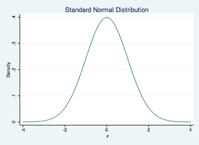
The twoway function plotting command is used to plot functions, such as y = mx + b. If we want to plot the density of a normal distribution across a range of x values, we type y=normalden(x). You can also include graphing options available to twoway plots (e.g., xtitle).
twoway function y=normalden(x), range(-4 4) xtitle("{it: x}") ///
ytitle("Density") title("Standard Normal Distribution")

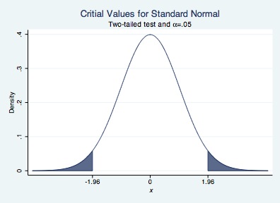
Suppose we want to shade parts of a distribution above (or below) a particular critical value. For example, we can shade a normal distribution above 1.96 and below -1.96 if we want critical values for a two-tailed test with an alpha-level of .05. To do this we will draw 3 graphs.
- A normal curve from -4 to -1.96
- A normal curve from -1.96 to 1.96
- A normal curve from 1.96 to 4
The choice of -4 and 4 as upper and lower bounds is arbitrary. You can connect the three graphs by using a double pipe, ||, between calls to the twoway function command. We will shade the area under the curve for #1 and #3 using the recast(area) option of twoway function. We will assign the color of the shading to dark navy blue using the color(dknavy) option. We will leave the area under the curve for #2 unshaded.
twoway function y=normalden(x), range(-1.96 1.96) color(dknavy) || ///
function y=normalden(x), range(-4 -1.96) recast(area) color(dknavy) || ///
function y=normalden(x), range(1.96 4) recast(area) color(dknavy) ///
xtitle("{it: x}") ///
ytitle("Density") title("Critial Values for Standard Normal") ///
subtitle("Two-tailed test and {&alpha}=.05") ///
legend(off) xlabel(-1.96 0 1.96)

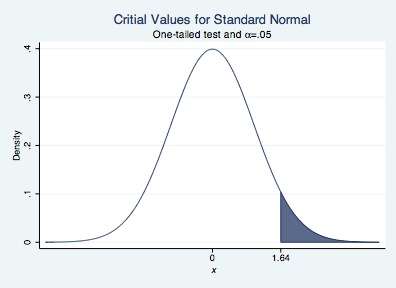
We can repeat for a one-tailed test.
twoway function y=normalden(x), range(-4 1.64) color(dknavy) || ///
function y=normalden(x), range(1.64 4) recast(area) color(dknavy) ///
xtitle("{it: x}") ///
ytitle("Density") title("Critial Values for Standard Normal") ///
subtitle("One-tailed test and {&alpha}=.05") ///
legend(off) xlabel(0 1.64)

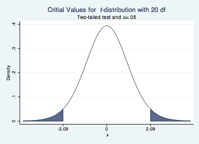
We can also visualize other distributions available in Stata. Below, I provide an example of a t-distribution with 20 degrees of freedom
twoway function y=tden(20,x), range(-2.09 2.09) color(dknavy) || ///
function y=tden(20,x), range(-4 -2.09) recast(area) color(dknavy) || ///
function y=tden(20,x), range(2.09 4) recast(area) color(dknavy) ///
xtitle("{it: x}") ///
ytitle("Density") title("Critial Values for {it: t}-distribution with 20 df") ///
subtitle("Two-tailed test and {&alpha}=.05") ///
legend(off) xlabel(-2.09 0 2.09)
